Branding - Aromatic Ashes Candles and Incense Company

Aromatic Ashes is a concept for a vegan candle and incense company. Made with ethically sourced and organic ingredients, a commitment to fair trade practices, and eco-friendly packaging, Aromatic Ashes promises that its sensuous candles and incense sticks don’t have to endanger the planet.
Aromatic Ashes wants to remind us that enjoying a lovely-smelling product doesn’t have to involve exploitation. It emphasizes that everyone deserves a pleasant-scented environment. Immerse yourself in delightful aromas and find your new favorite candle or incense.
Branding includes logos, branding identity, packaging, product design, and ephemera
Logos and Brand Identity
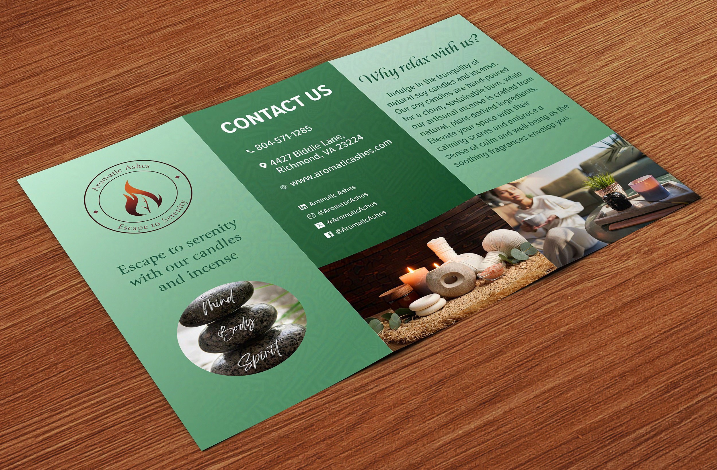
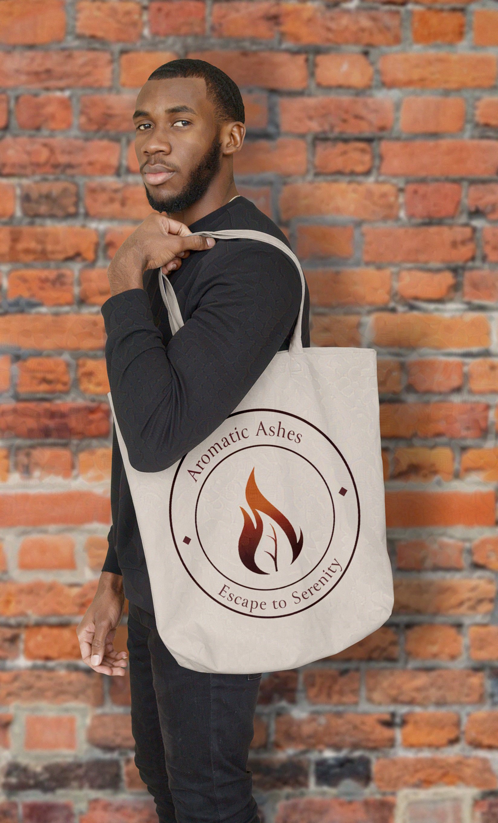
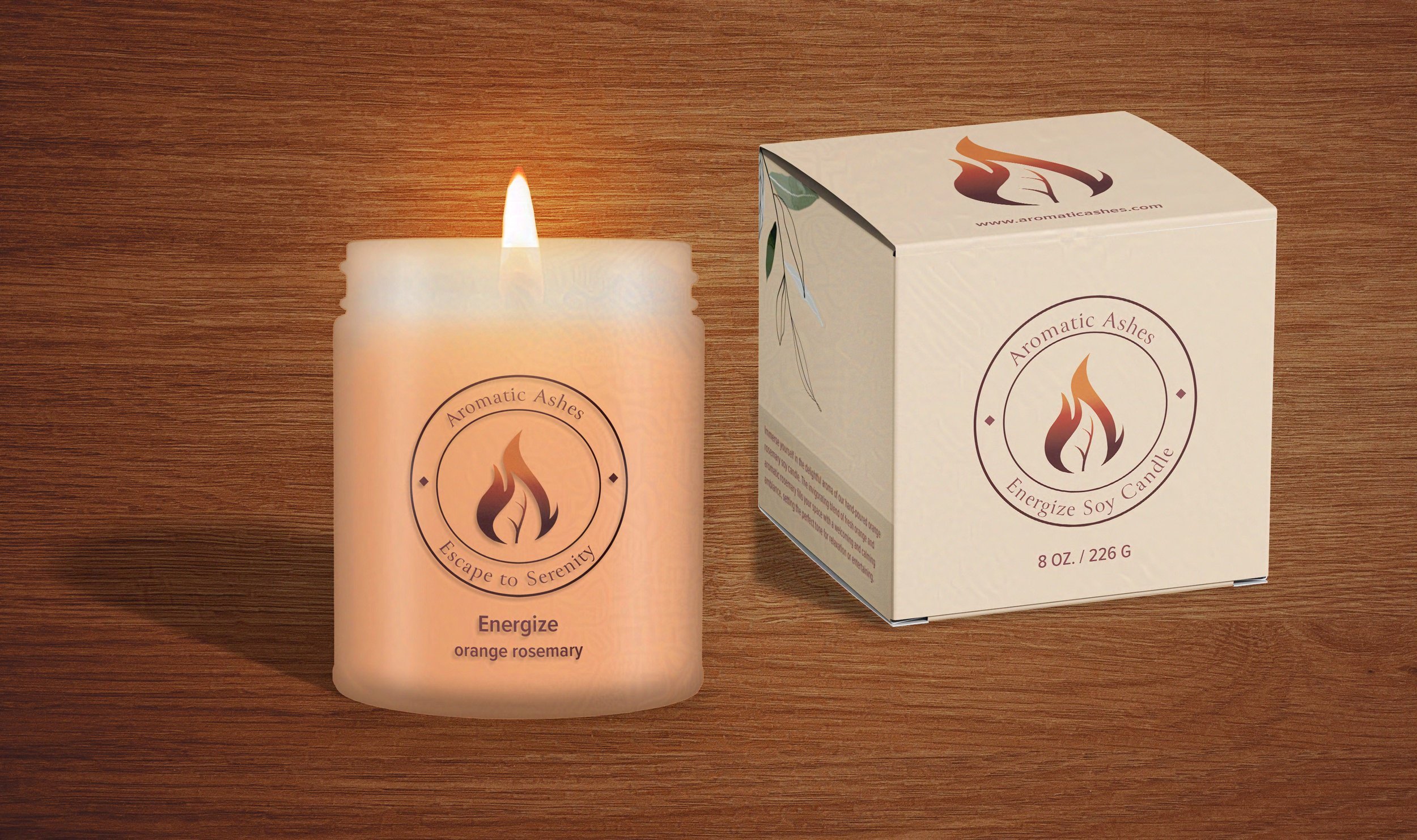
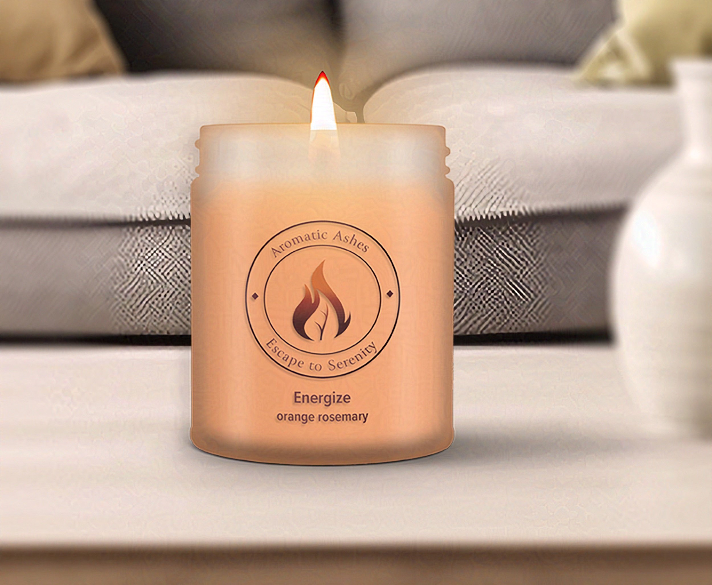
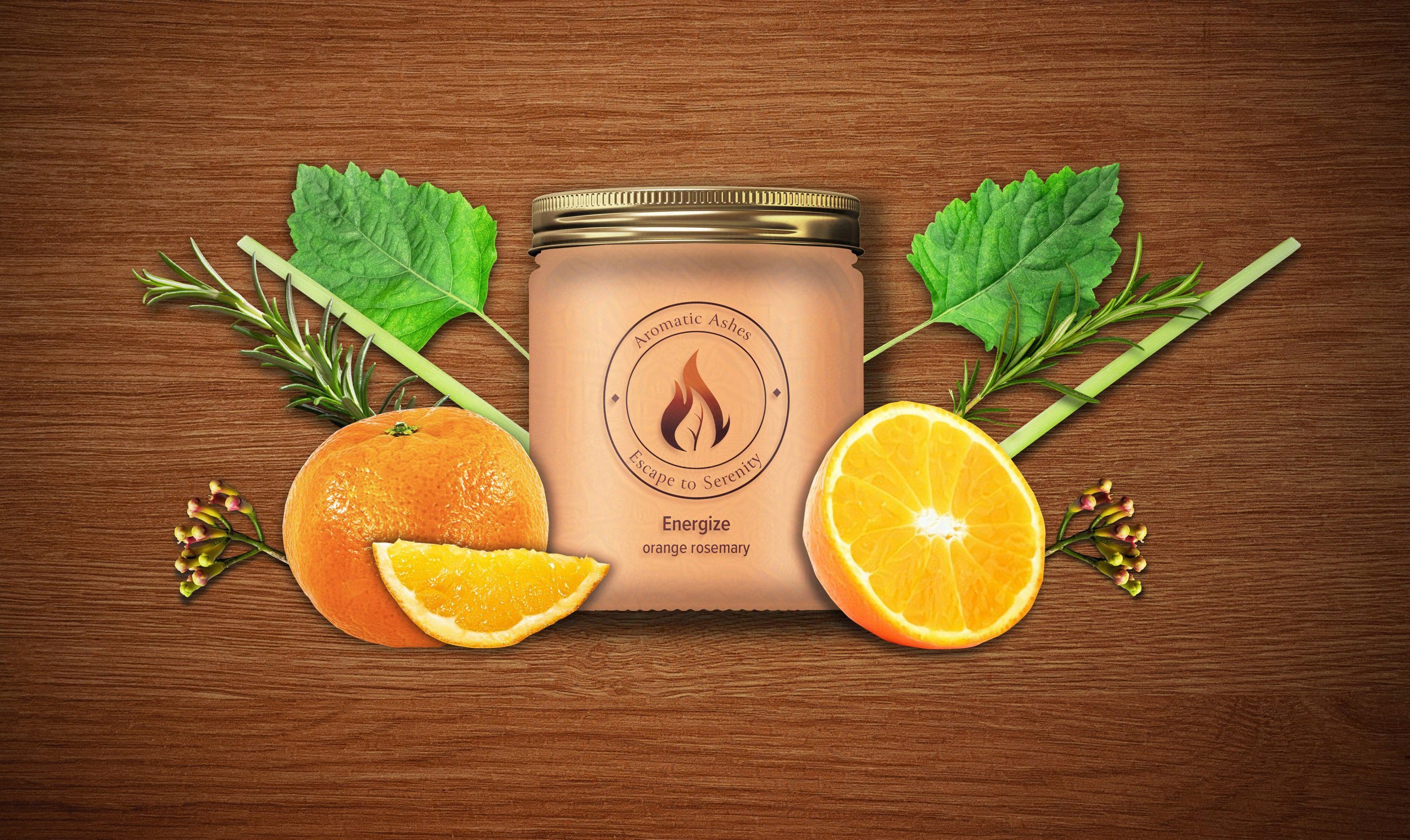
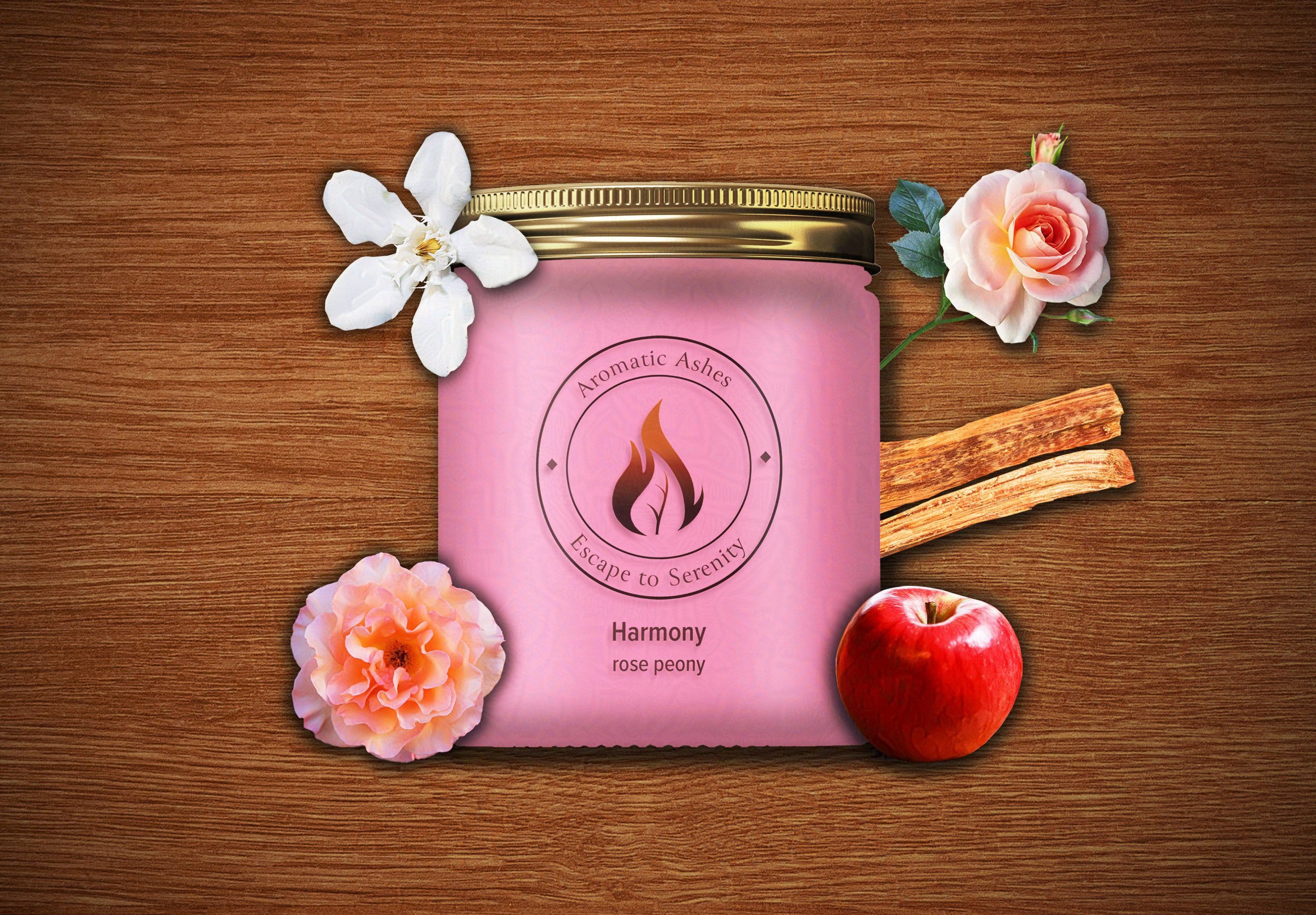
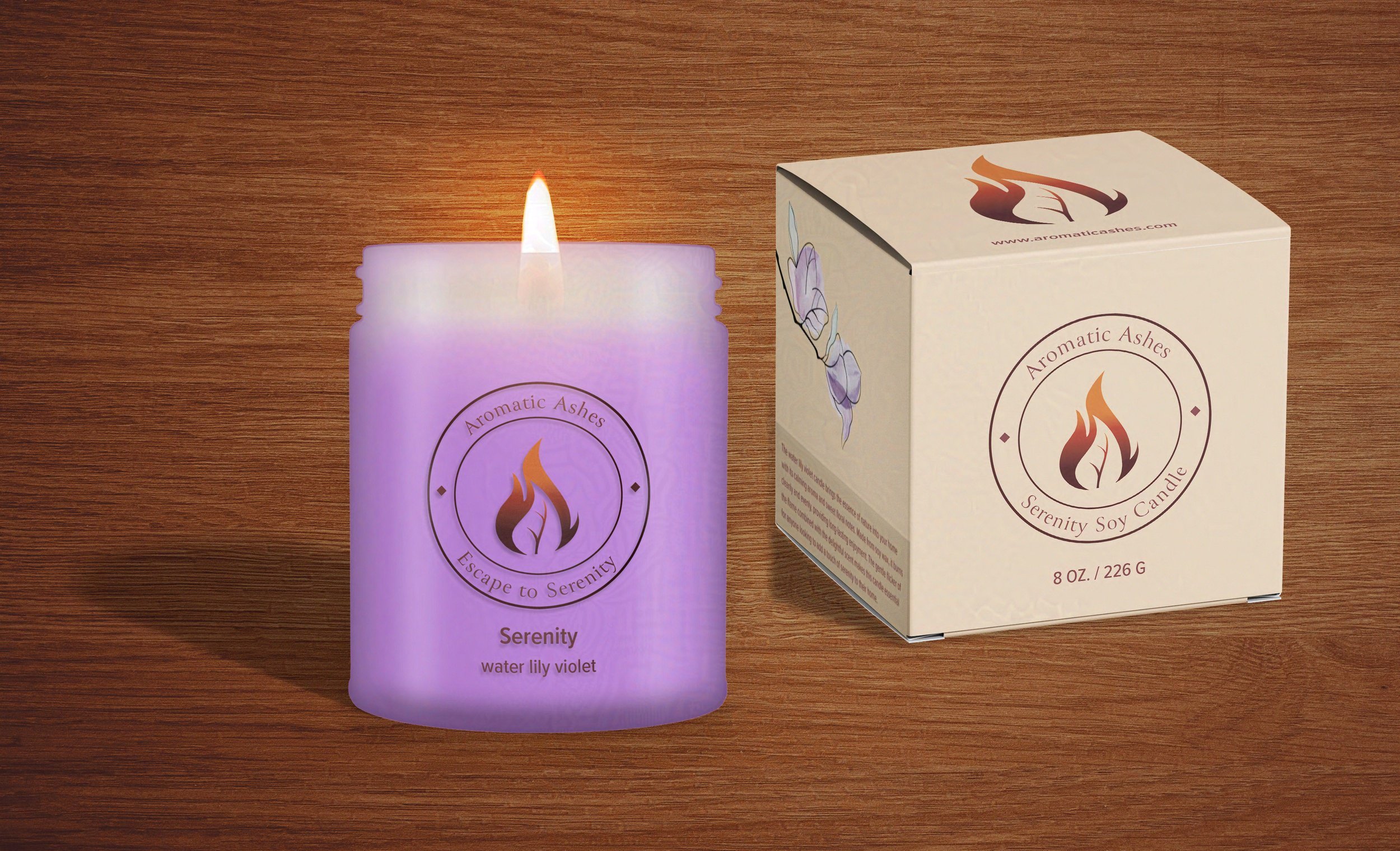
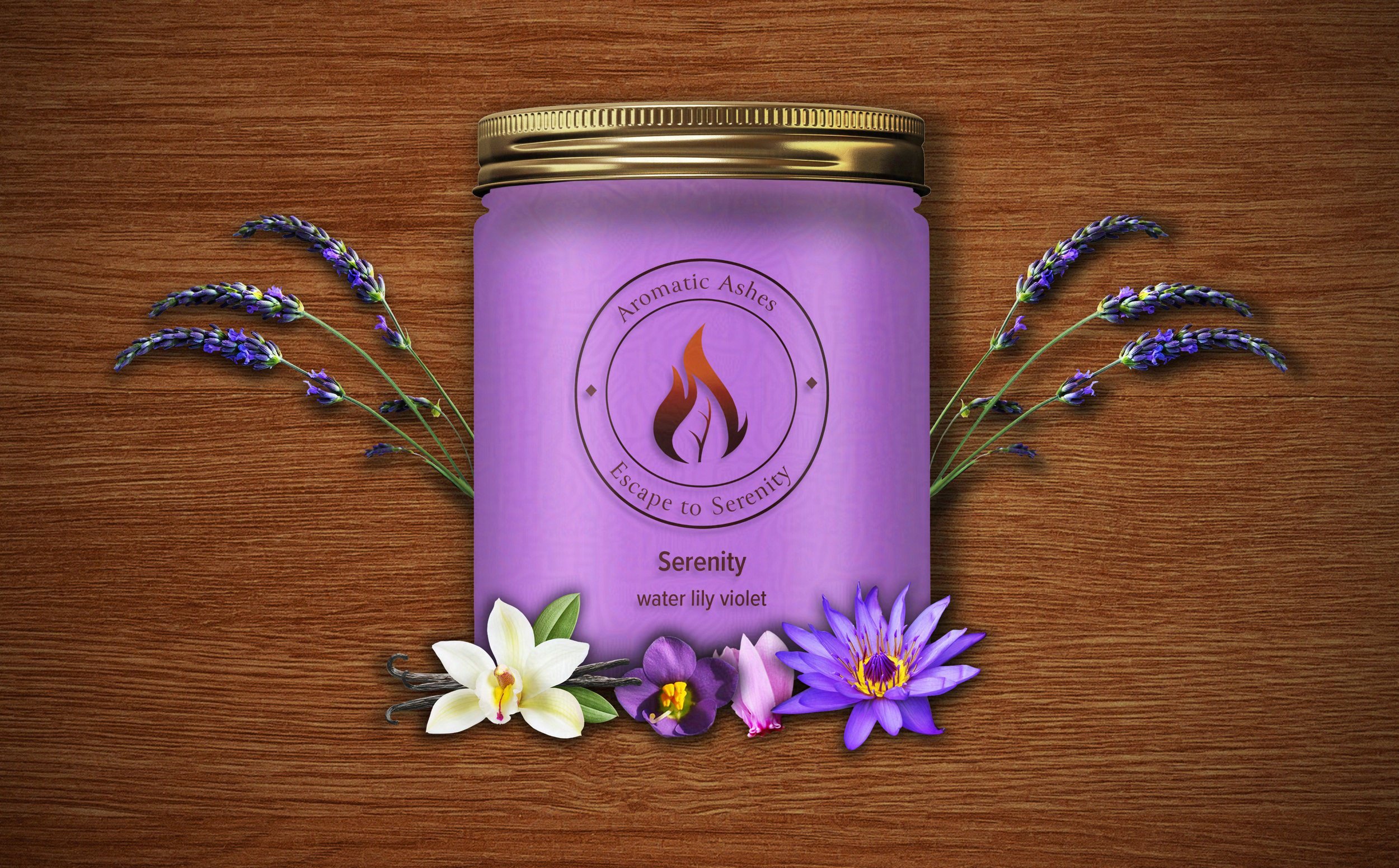
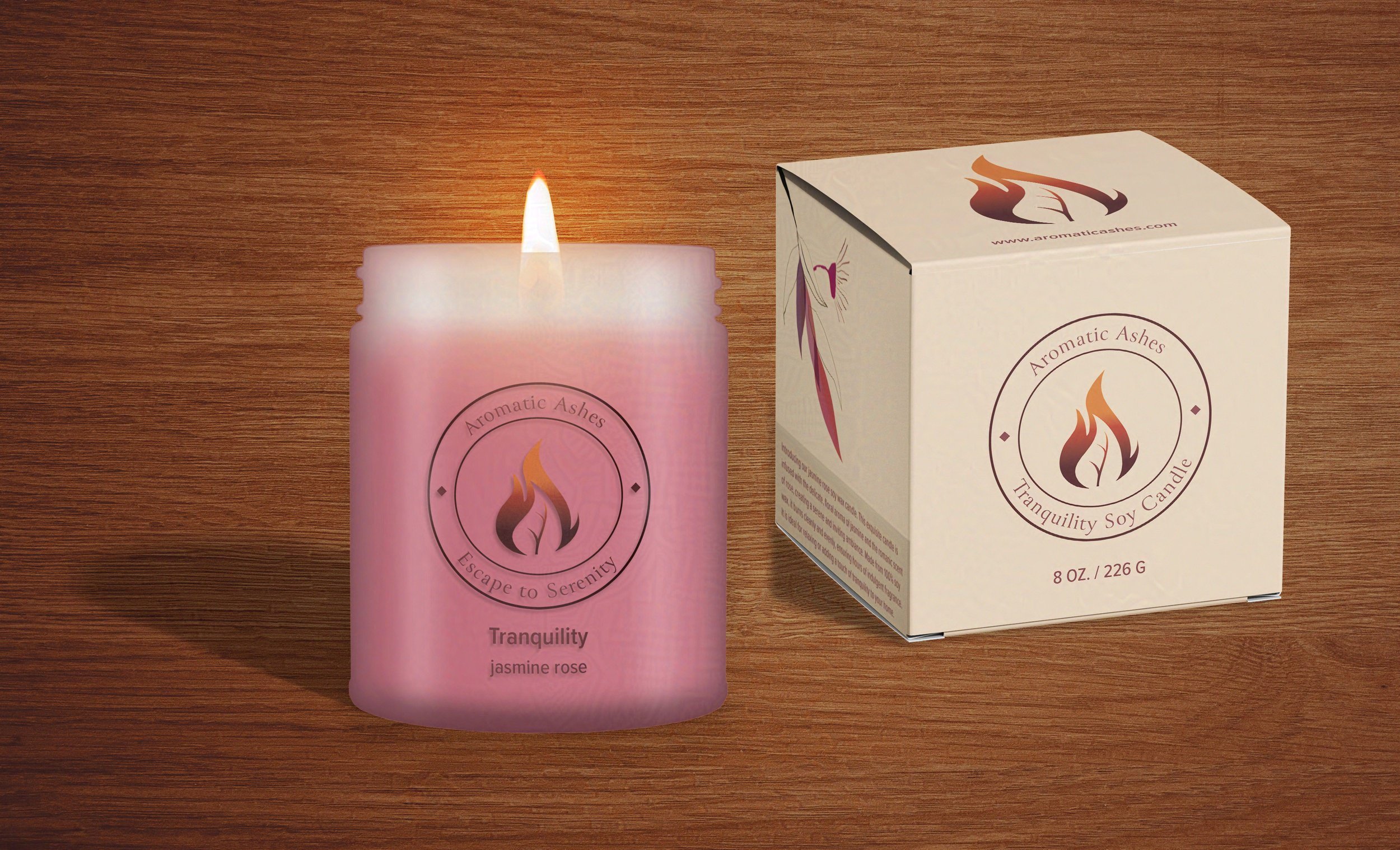
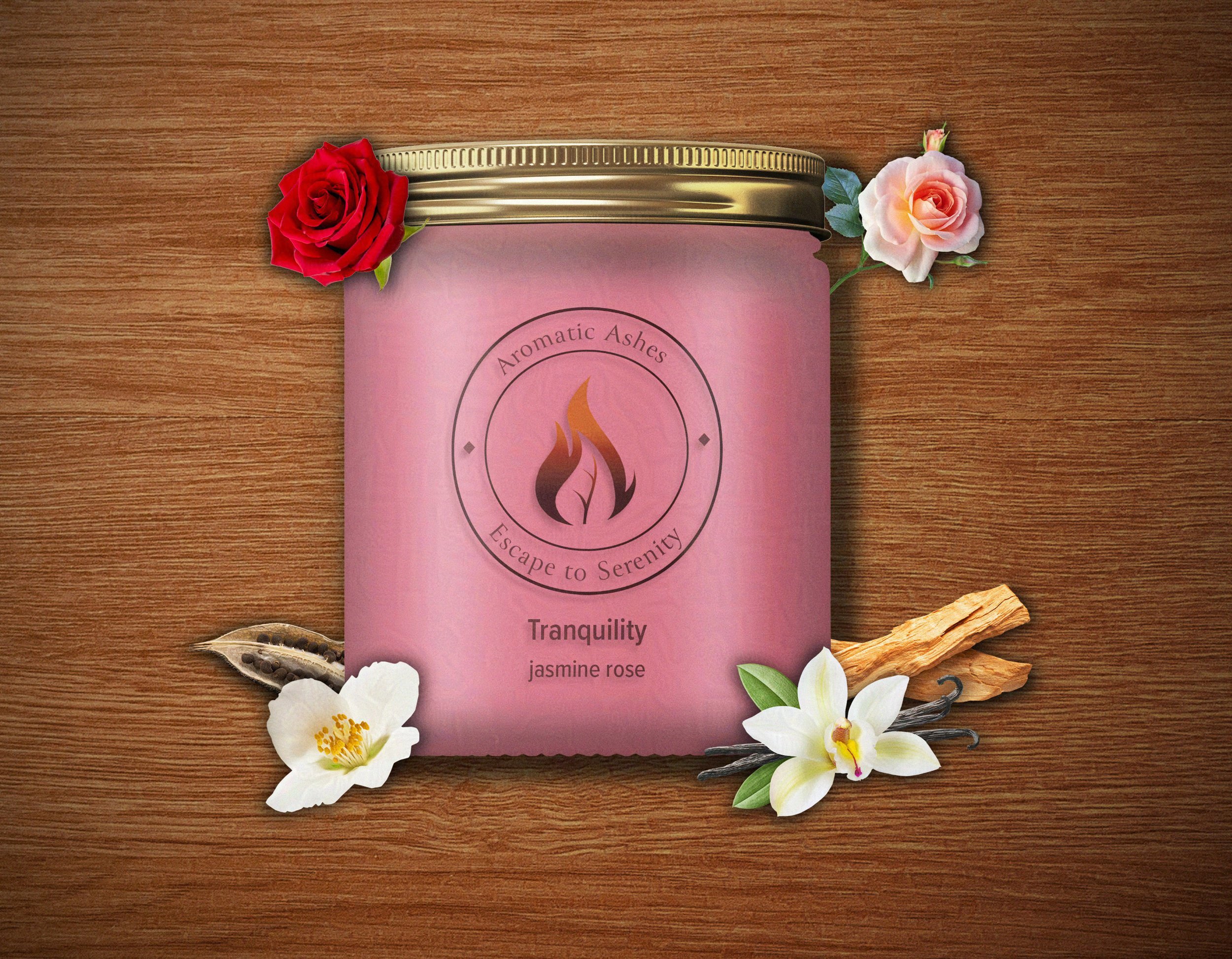
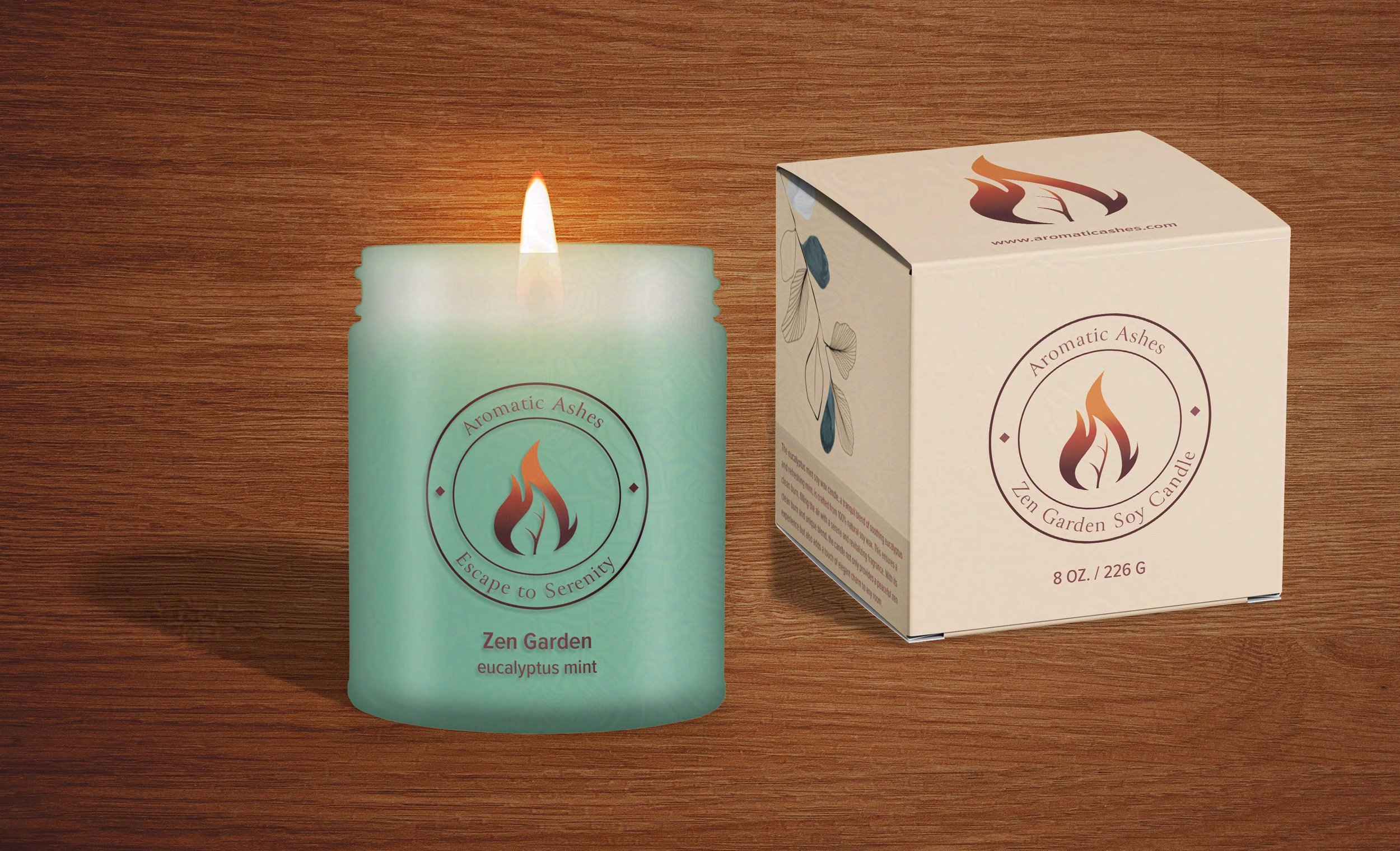
I focused on balancing natural elegance and simplicity in constructing the brand identity for my candle and incense company concept, Aromatic Ashes. I wanted the logo’s central symbol, the leaf nested inside a candle flame, to evoke the company’s mission of always using the finest botanical ingredients in their candles and incense in customers’ minds. For a color palette, I chose a warm medley of fiery reds, oranges, and purples to conjure a warm candle flame. Combining the icon with a catchy tagline creates a logo that is not just a design but the start of a memorable brand identity.


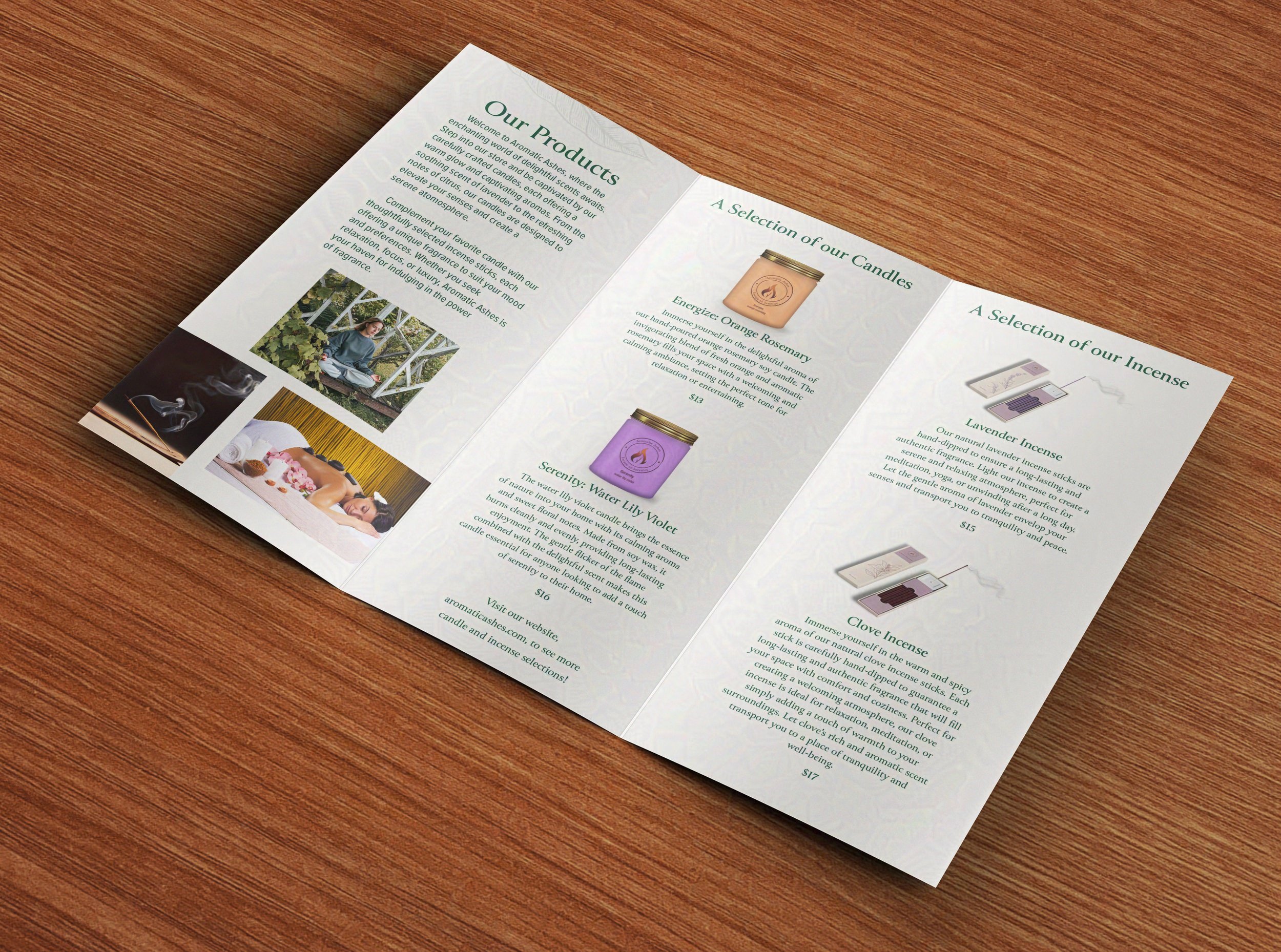
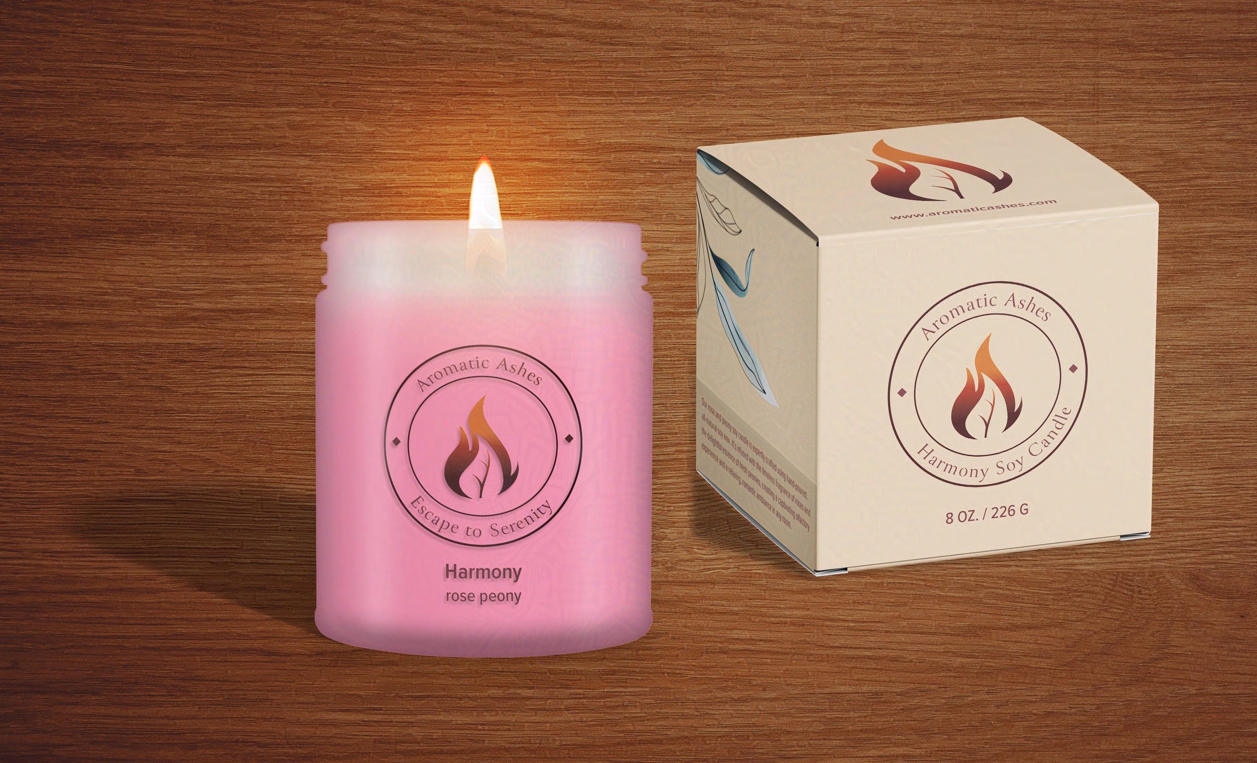
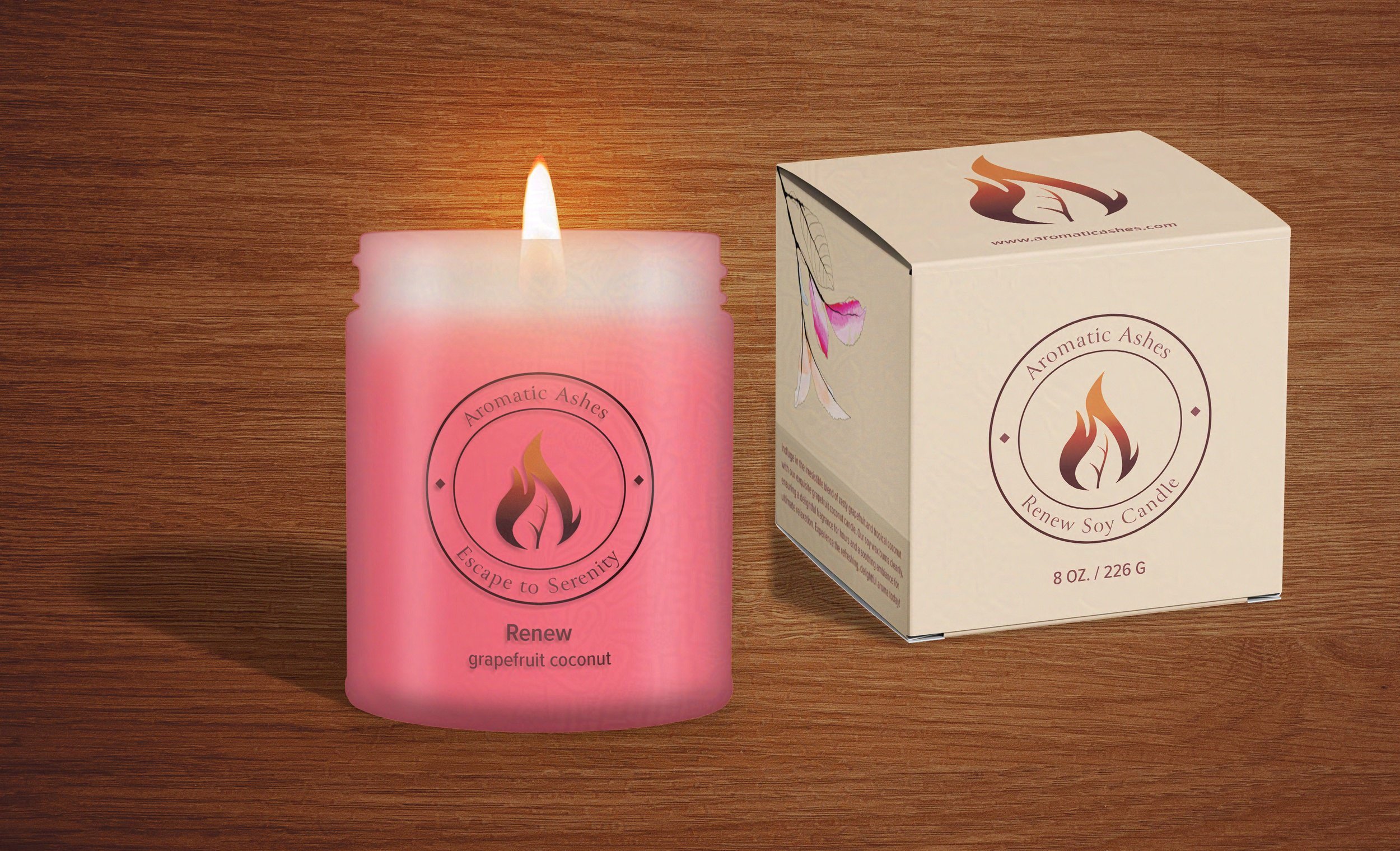
Candle Packaging and Product Design
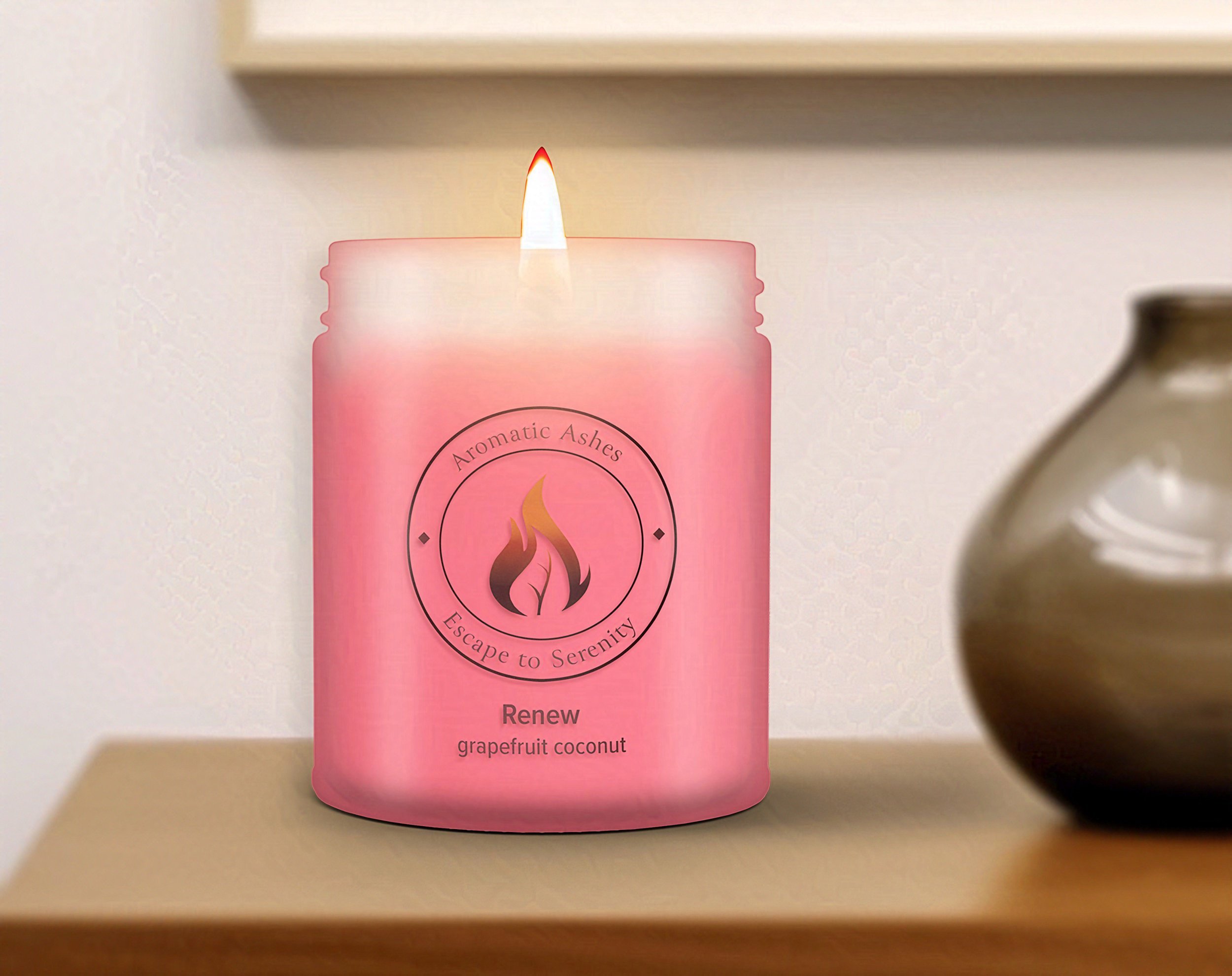
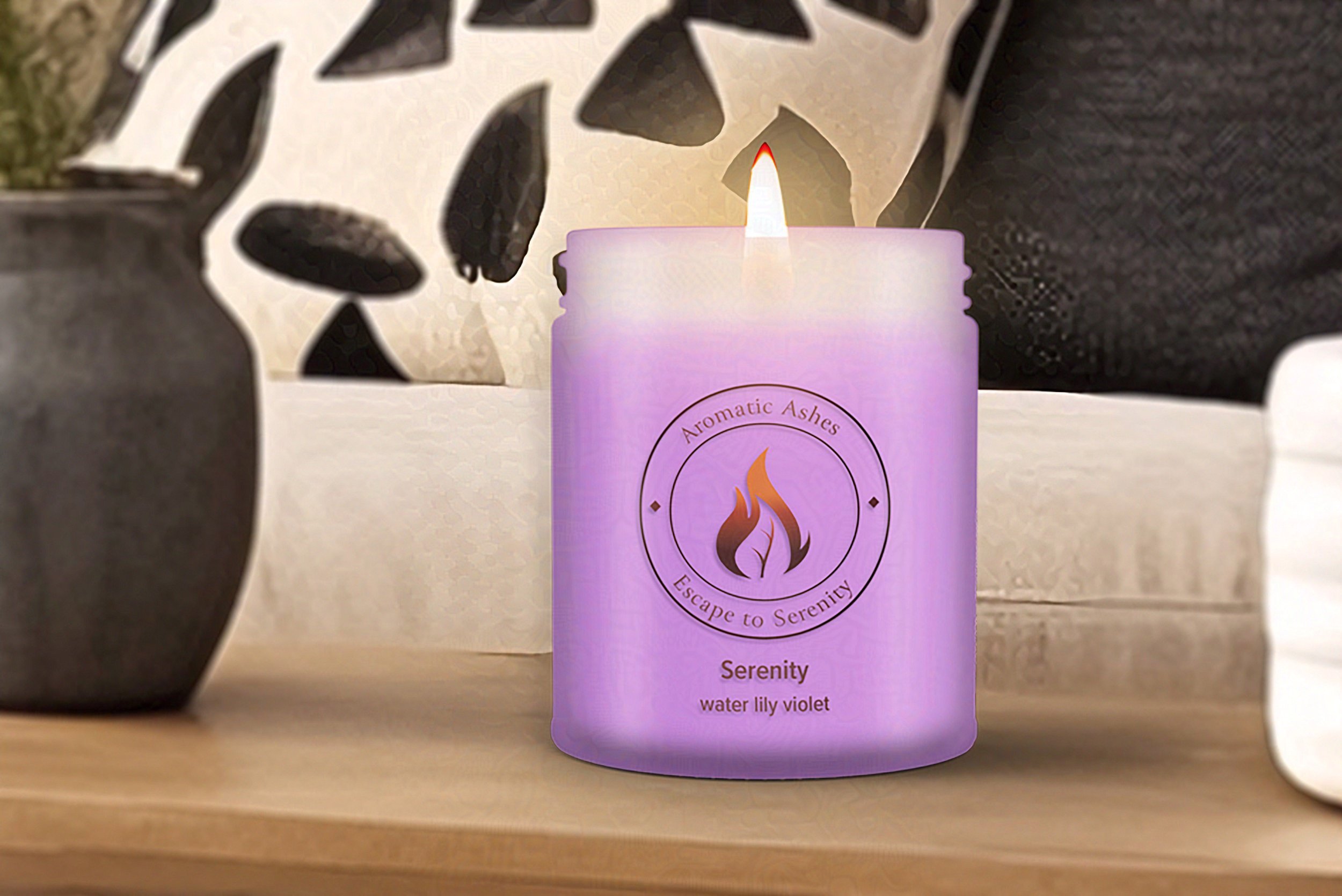
For my candle packaging, I drew inspiration from nature’s beautiful, organic forms. I kept the candle’s packaging simple, with a clear label showing the logo and candle name, allowing the beautifully colored wax to take center stage. I decided to produce the box in an understated, warm beige to contrast with the fiery colors of the logo. For visual interest and another pop of color, I added an abstract botanical design to the side of the box in colors that coordinated with the candle.


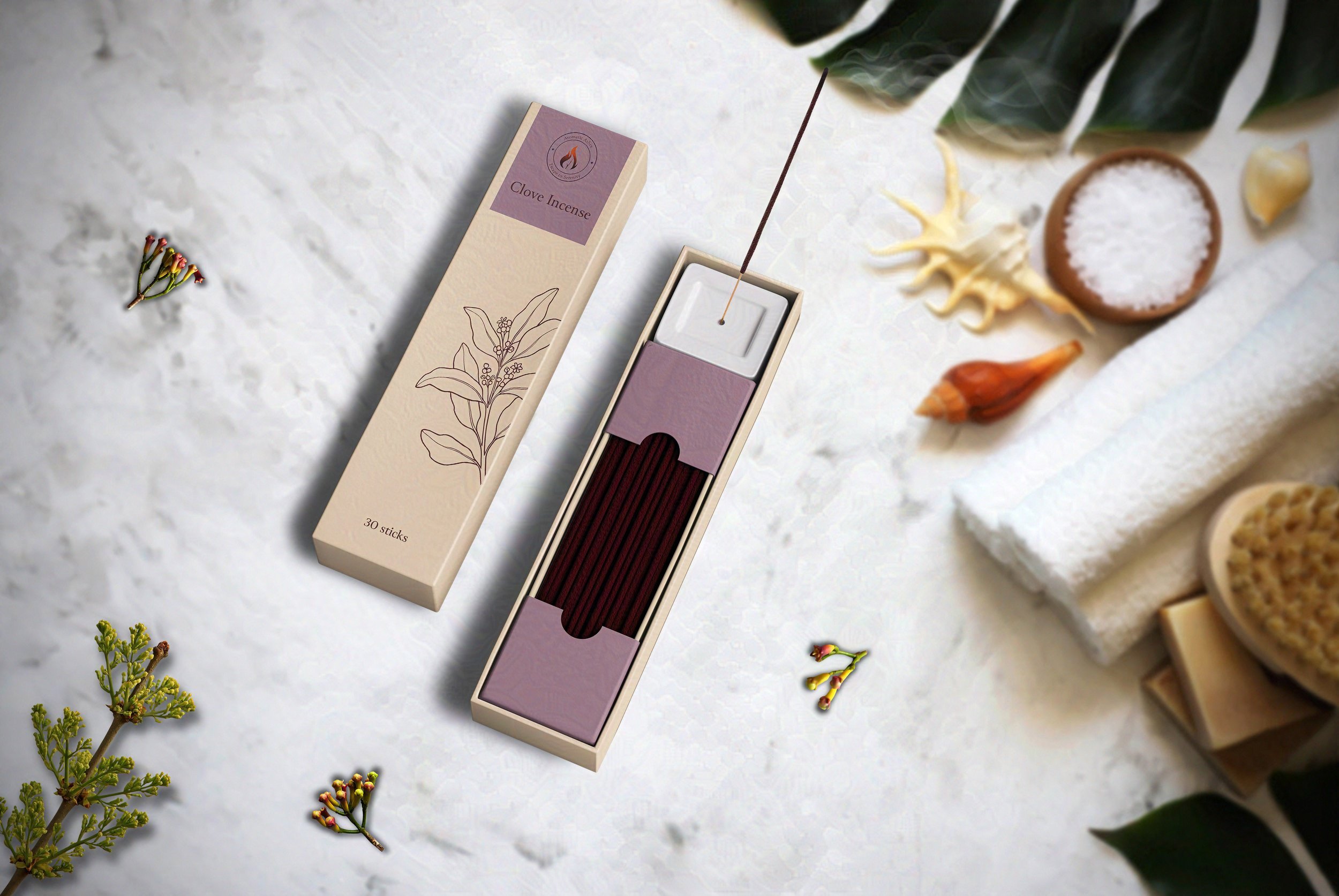
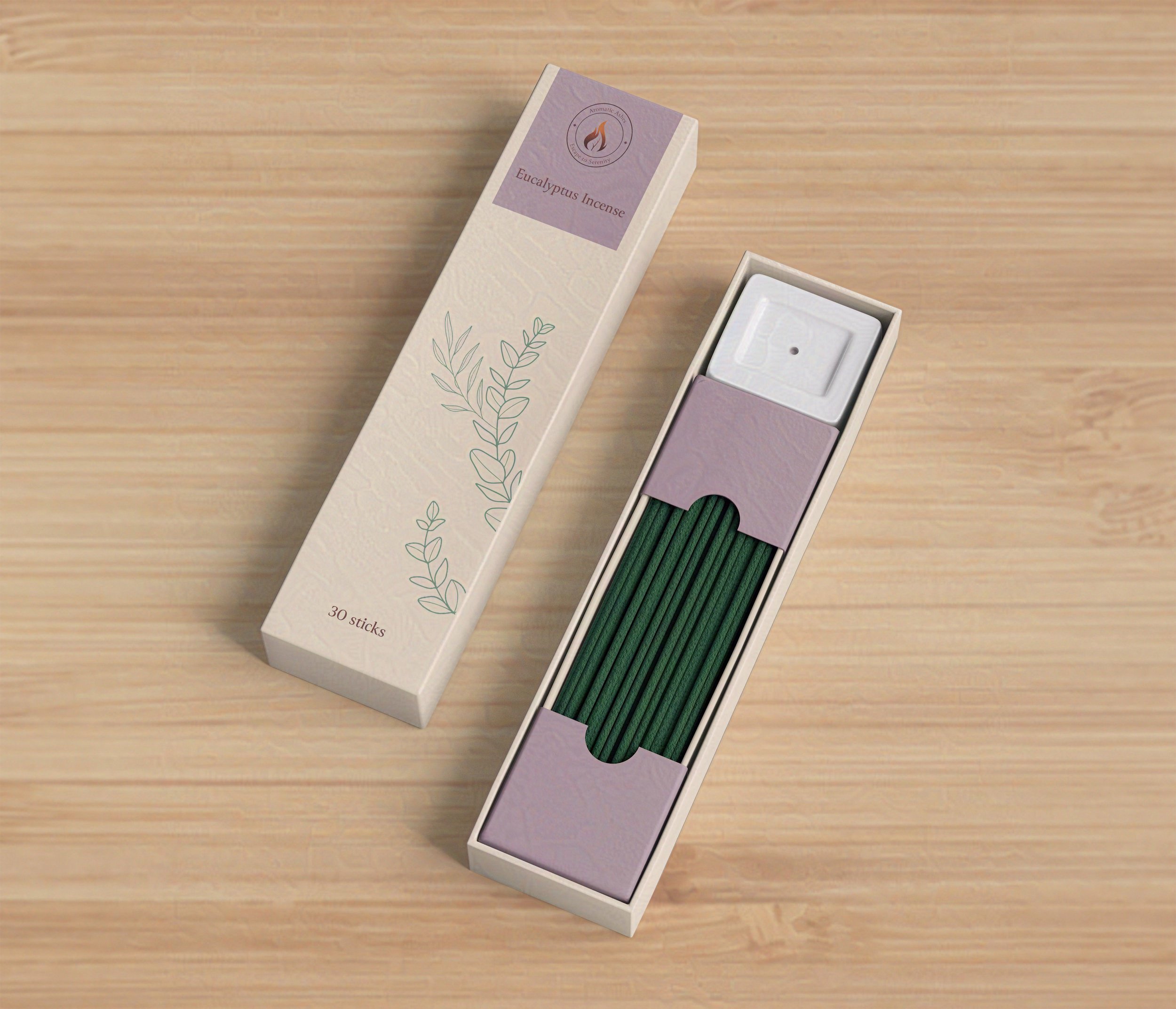
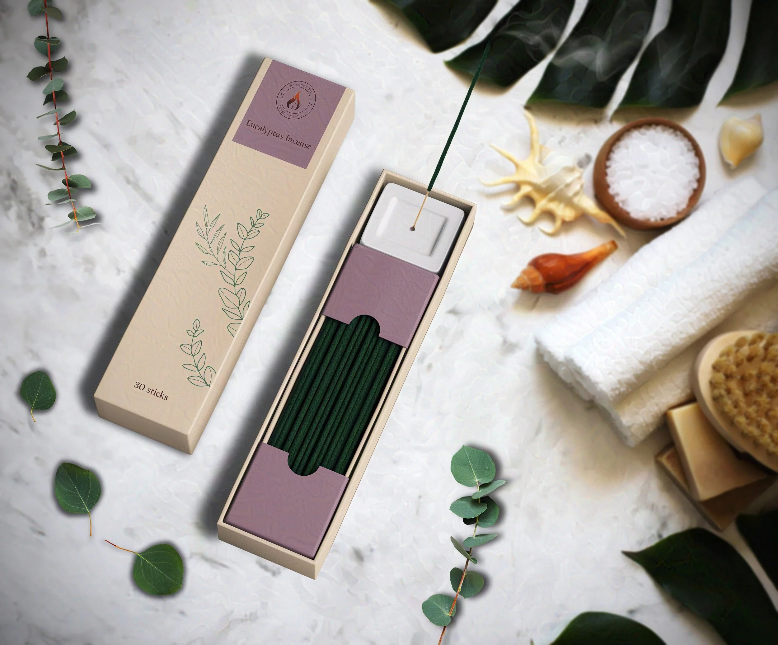
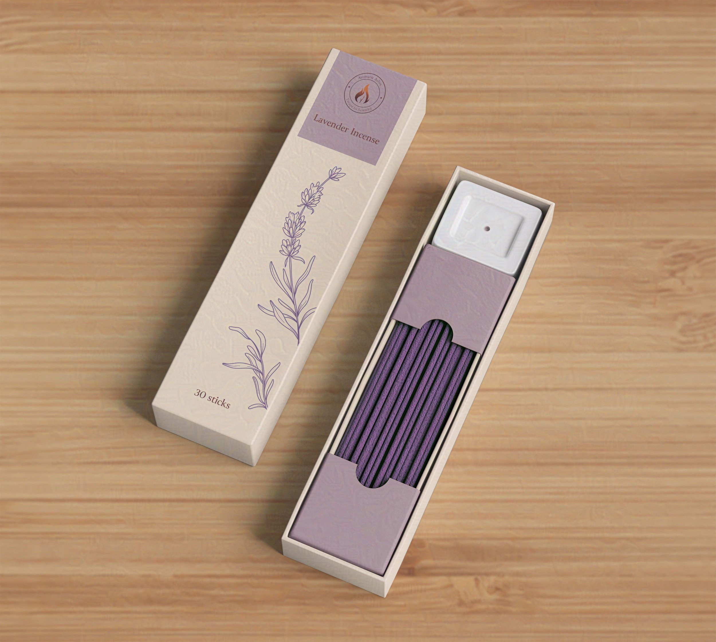
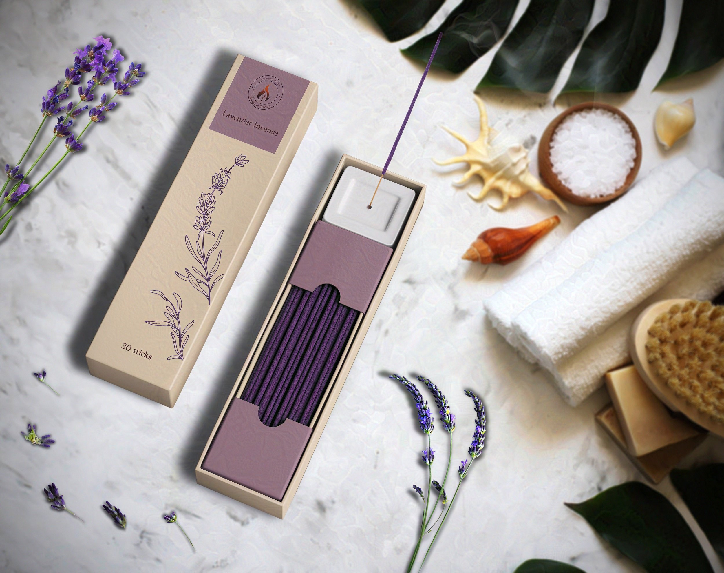
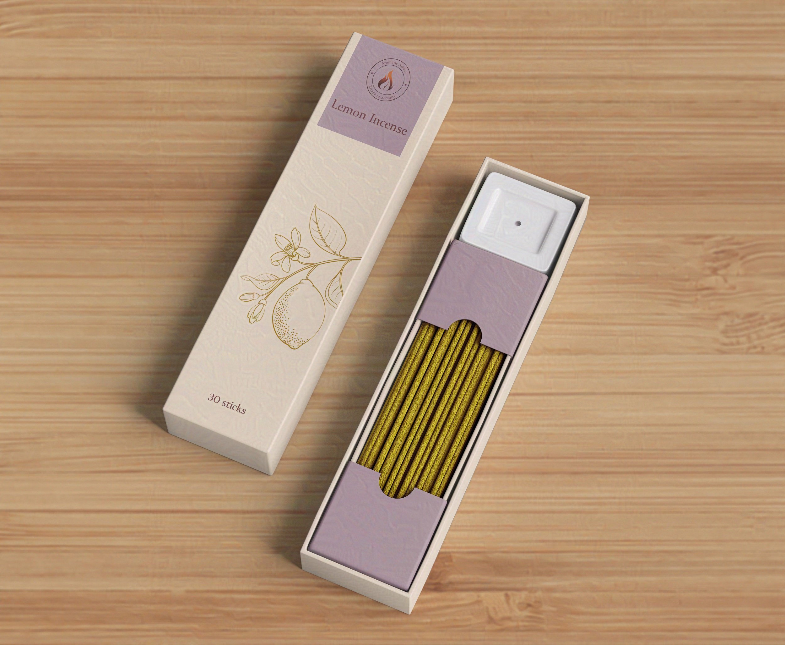
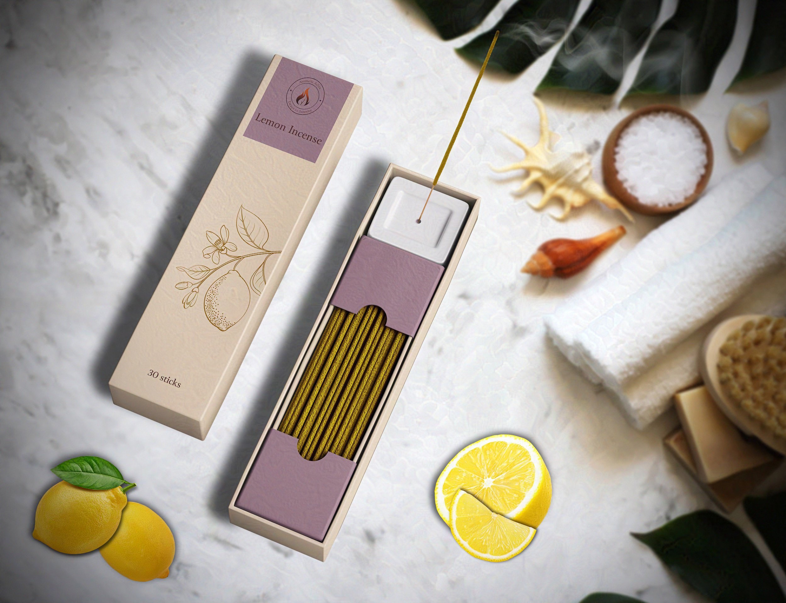
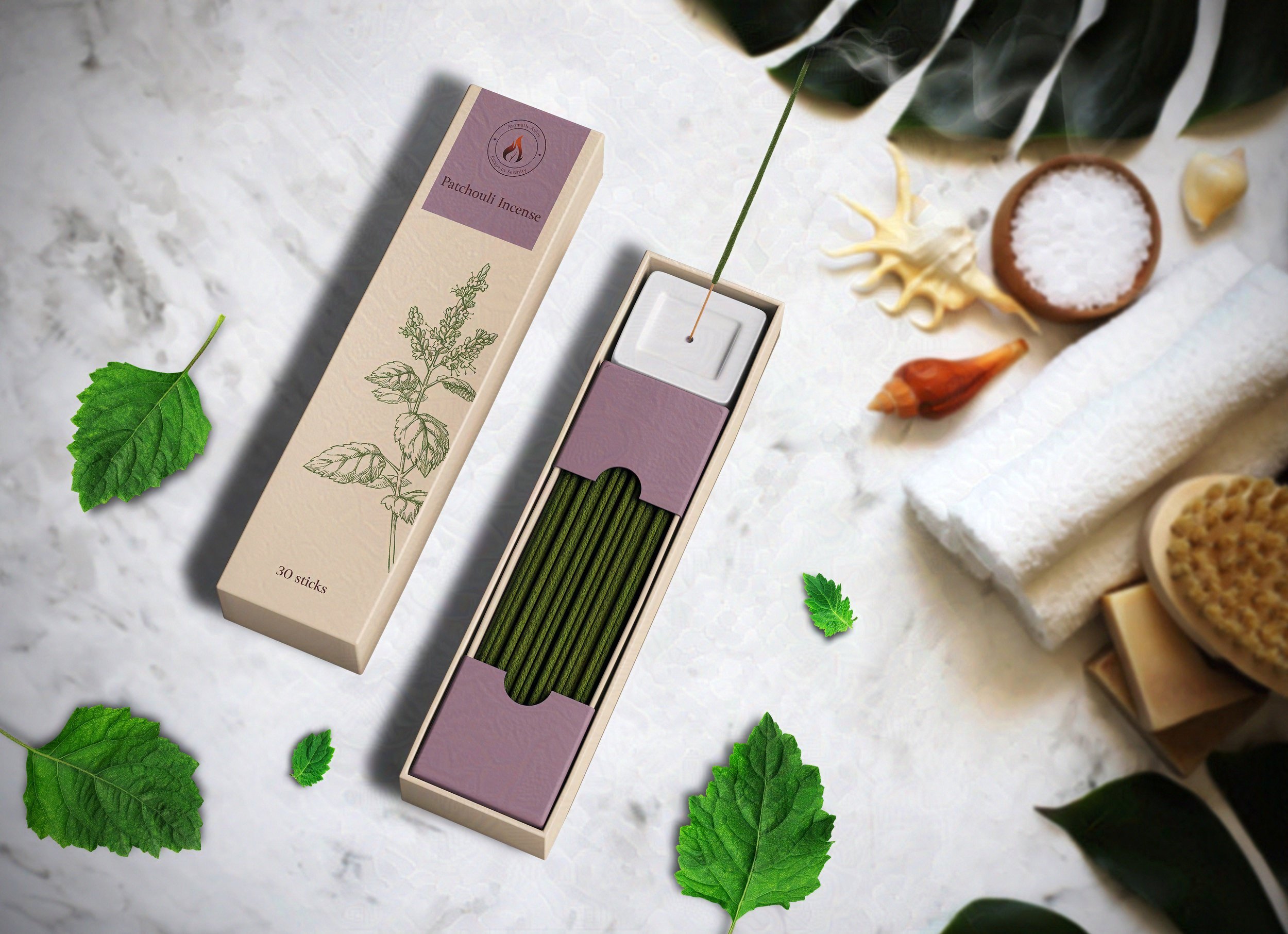
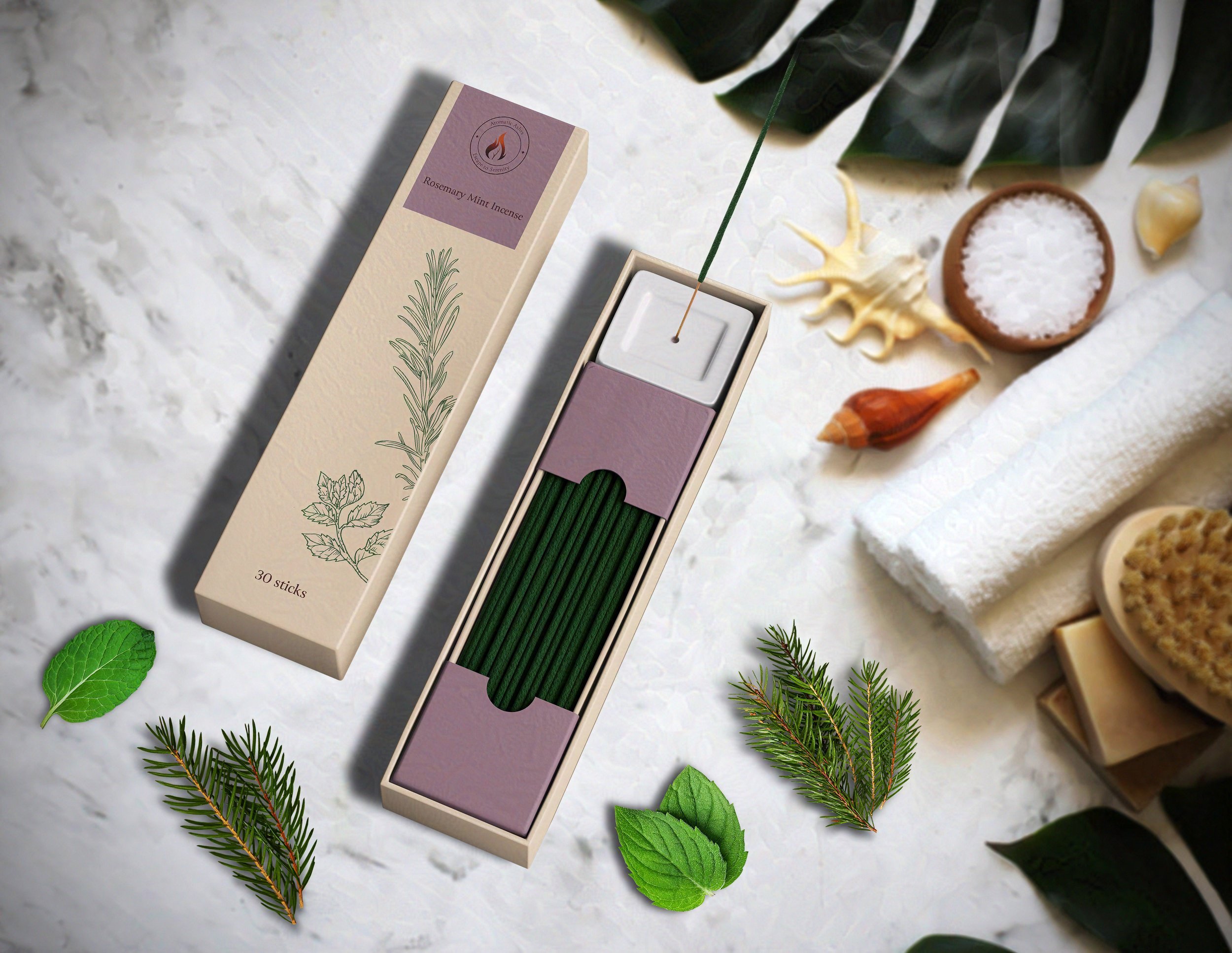
Incense Packaging and Product Design
I drew inspiration from botanical designs when creating my incense packaging. Like my candle packaging, I chose the same warm beige as a box color. To add to the calm, soothing feeling evoked by the incense, I decide to make the inner box a warm lavender color, in contrast to the beige color of the outer box. I kept the packaging modern and clean, allowing the incense ingredients to take center stage on the front of the box. The illustrations changed color according to the type of incense.